.png.58cfe414f117a5b917dfc7f637393e58.png)


Classic Sonic design

By SadVlad
- 264 views
- View SadVlad's images
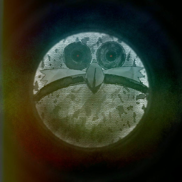
The first submission I made of this artwork looked a little off and slightly disturbing to me. I was going for a classic design but the modern green pupils just did not fit. And I decided to add the original tan eyelids for more detail, and to add some expression to Sonic's blank stare. I also decided to remove the extra glare and shading because I didn't feel that the aesthetic looked as good as I first thought, ultimately taking way from the appeal of the piece by adding too much unnecessary tone.
Recommended Comments
There are no comments to display.
Create an account or sign in to comment
You need to be a member in order to leave a comment
Create an account
Sign up for a new account in our community. It's easy!
Register a new accountSign in
Already have an account? Sign in here.
Sign In Now